GitHub Actions metrics and analytics
View GitHub Actions metrics in the Depot dashboard
Use the following pages to monitor and analyze your GitHub Actions jobs.
- Monitor active jobs: The GitHub Actions main page shows queued, running, and completed jobs across all repositories with live runner status.
- Analyze performance: The GitHub Actions analytics page visualizes job metrics, identifies slowest jobs, and shows CPU/memory utilization trends over time.
- Optimize runner sizes: The GitHub Actions insights page provides automated recommendations based on your job performance and resource utilization.
- Track usage and costs: The organization usage page displays monthly billable minutes, job counts, and storage metrics across all Depot products.
Analyze and optimize GitHub Actions job performance
The following are some common scenarios for analyzing and optimizing GitHub Actions job performance.
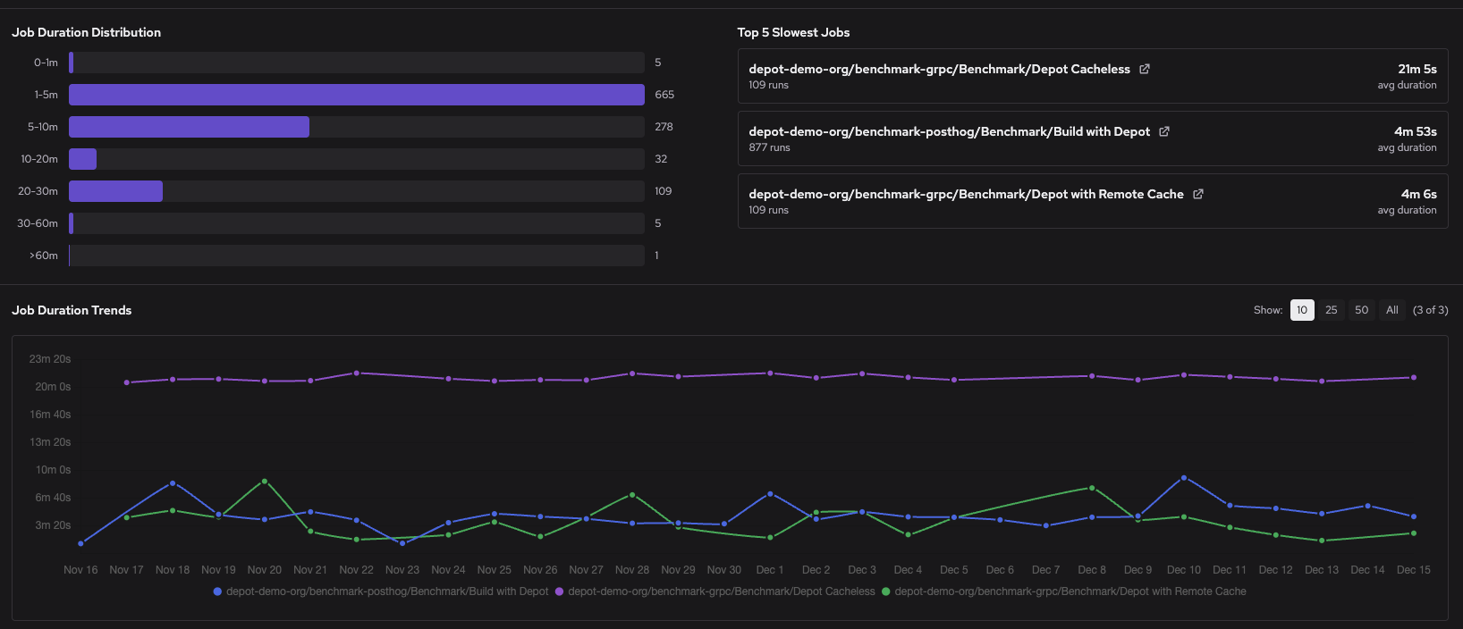
Identify slow jobs
If you're seeing consistently slow builds or recent performance regressions, Depot's analytics can help you identify the cause.
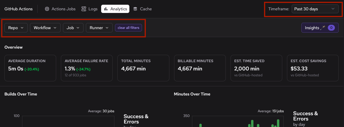
First, go to your organization's GitHub Actions Analytics page. The page displays a Top 5 Slowest Jobs list of your most time-consuming jobs across all repositories and workflows. Use the duration trends graph to spot jobs that have recently slowed down or to identify patterns over time.
To narrow your investigation, use the filter controls to select specific repositories, workflows, or time ranges.
Scatter plots for CPU utilization and memory usage help identify jobs with unusual resource patterns that could indicate constraints.
Click a job in the Top 5 Slowest Jobs list to view the 50 slowest runs for that job. Then click a specific run to open the detailed job view.
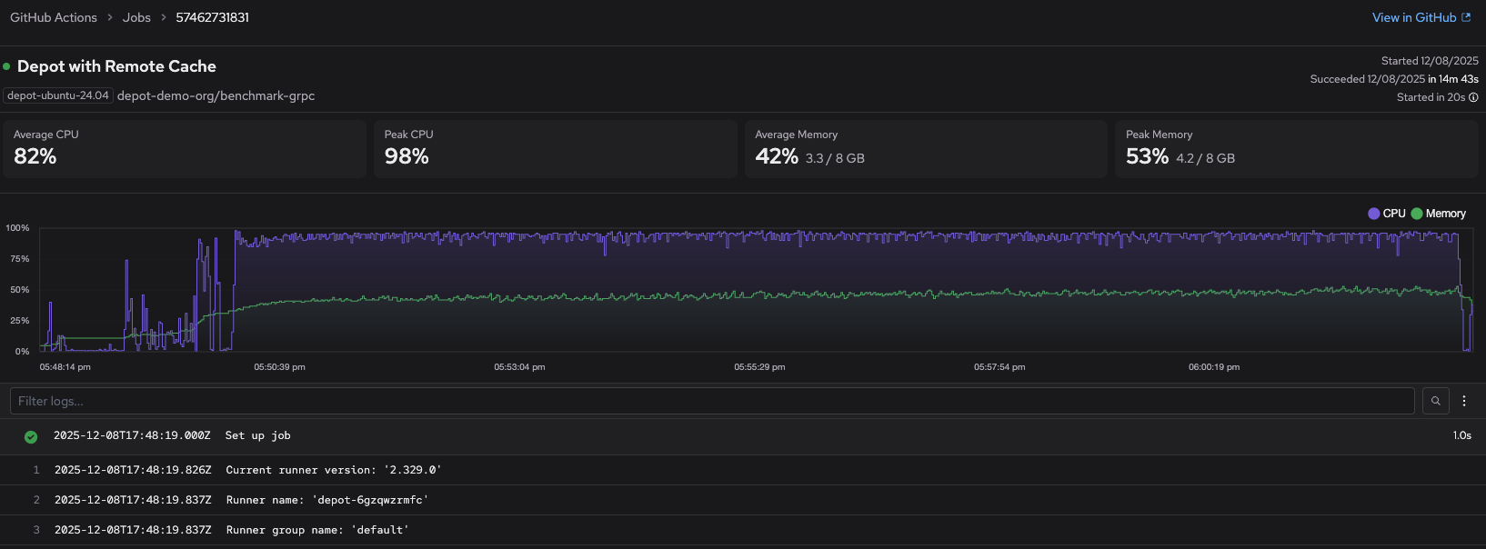
This page provides step-level timing breakdowns and resource utilization graphs, helping you identify common bottlenecks like dependency installation, test execution, or cache misses. For deeper investigation, use the Logs page to search across multiple job runs by keyword.
Right-size your runners
If your jobs are consistently underutilizing or maxing out CPU and memory resources, you may be over-provisioned or under-provisioned. Depot analyzes your resource usage patterns to recommend optimal runner sizes and surfaces the recommendations on the Insights page. Insights appear when there's a consistent pattern of resource over- or underutilization.
From the GitHub Actions analytics page, click Insights on the upper right.
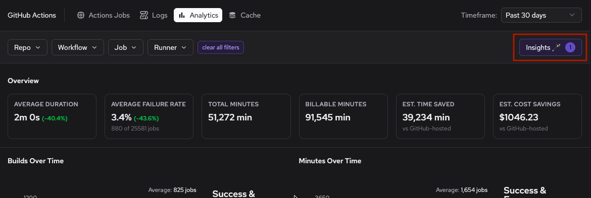
The Insights page provides two types of recommendations based on historical job performance data. The following example shows both size-up and size-down recommendations.
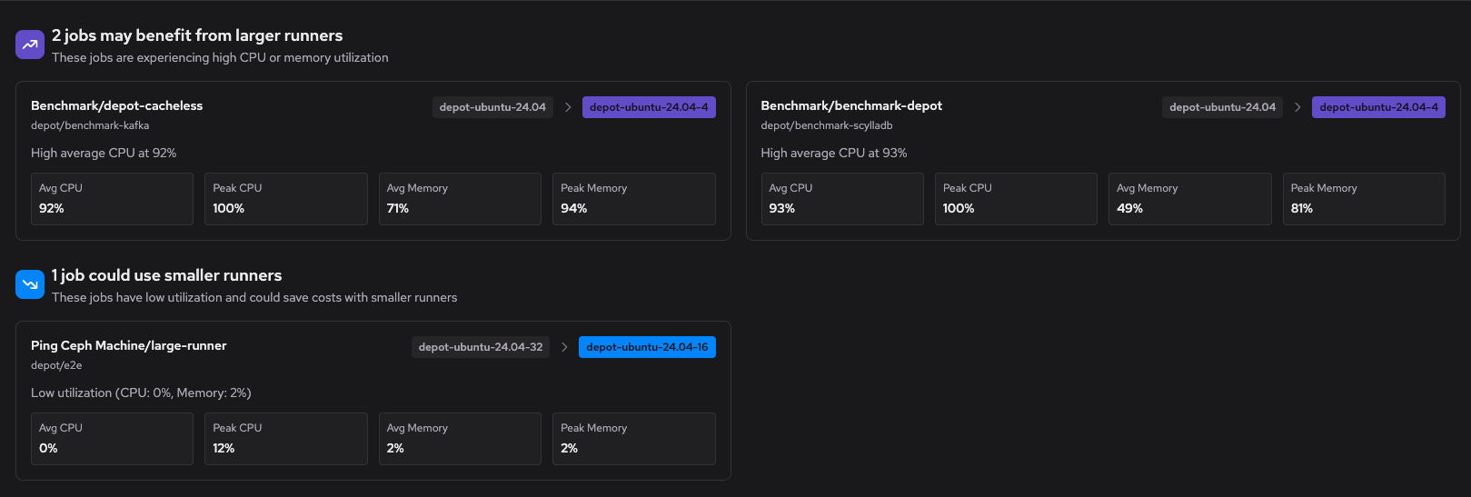
Size-up recommendations identify jobs that are constrained by their current runner size. These jobs show signs of resource exhaustion (high CPU or memory utilization) that could be slowing down execution. Upgrading to a larger runner can reduce build times for these workloads.
Size-down recommendations identify jobs that consistently use much fewer than their allocated resources. These jobs could run on smaller, more cost-effective runners without impacting performance. Downsizing reduces billable minutes and optimizes your infrastructure spend.
Recommendations include the current runner label, the suggested runner label, and the resource utilization patterns that informed the recommendation. If you have multiple recommendations across your organization, use the filter controls to focus on specific repositories or workflows.
Debug failures
When multiple jobs fail repeatedly or show unexpected failure patterns, it can help to review your analytics for trends before diving into individual logs.
Go to your organization's GitHub Actions Analytics page and review the failure rate metrics. The Overview section displays your average failure rate with a trend indicator showing whether failures are increasing or decreasing. The failure count shows the total number of failures during your selected timeframe.
Scroll down to the Job Failure Rates chart to identify which jobs are failing most frequently.
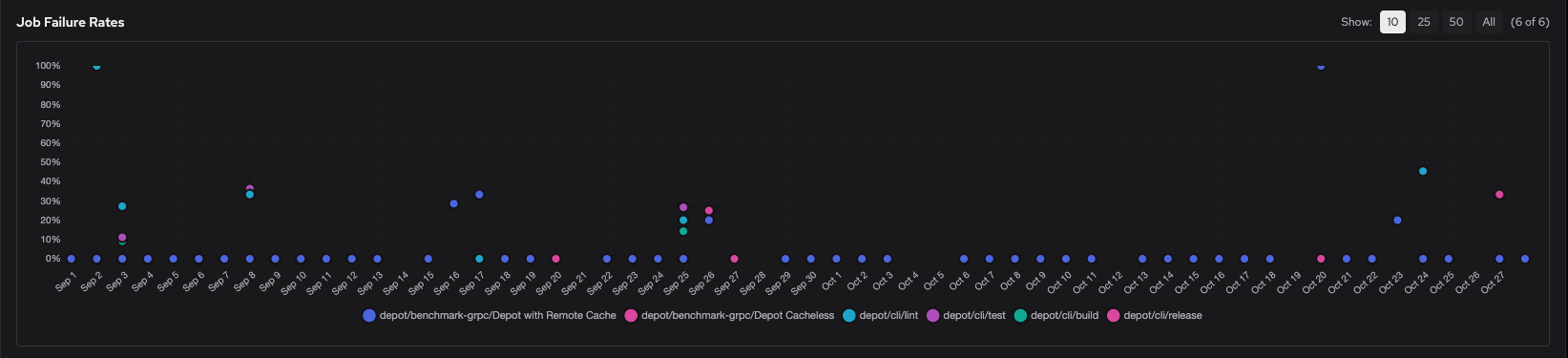
The scatter plot shows failure rates over time for each job, so you can spot jobs with consistent failures or recent spikes. Click individual data points to filter the view and focus on specific jobs.
Below the Job Failure Rates chart, expand the Job Failure Summary to view an aggregated list of jobs sorted by failure rate.
Use the filter controls at the top of the Analytics page to narrow your investigation to specific repositories, workflows, or time ranges where failures occurred.
Once you've identified problematic jobs or patterns in the metrics, investigate the specific causes:
- Use the Logs page to search for error messages and keywords across failed job runs. The logs page supports filtering by repository, workflow, and time range to help you find relevant failures.
- Refer to the Troubleshooting guide for solutions to common errors like disk space issues, connectivity problems, memory exhaustion, and runner allocation failures.